to
Adult Education index
| Fonts Colours Caps/Italics/Underline Bullets Grabbing Attention Images You | ||
|
|
 to Adult Education index |
|
|
1. Reds and oranges are high-energy but can be difficult to stay focused on. 2. Greens, blues, and browns are mellower, but not as attention grabbing. 3. White on dark background should not be used if the audience is more than 20 feet away.
|
|
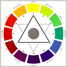
4. Colours separated by another colour are contrasting colours (also known as complementary). 5. Adjacent colours (next to each other) harmonize with one another. e.g. Green and Yellow. |
 |
|
6. The next 2 colour
wheels are simplified for easy use. 7. Colors that are
directly opposite from one another are said to clash. 8. These provide
readability - e.g. yellow on blue.
|
|